Overview
Role: A solo design exploration, completing all of the UX and UI design
Timeline: 5 weeks
Tools Used: Figma/Adobe Illustrator
Client Problem
Online orders are low, and users are having a hard time ordering through the web
I then interviewed 5 different users to understand pain points they experienced when using different goal apps. I then conducted 8 online surveys to better determine user pain points and needs.
Interview Goals:
Discover what frustrations and pain points users have when using food ordering products.
Sort user values when ordering food
Deconstruct user process and psychology when ordering food
How might we navigate around user pain points throughout the entire process?
Summary of User Interviews and Survey
Preferences
3 out of 5 users said that they preferred to have a mobile app options because they often times do not want to talk to a sales associate. Users also preferred to have the status of their order updated frequently. All users also agreed that a points systems kept them coming back and was rewarding to use.
Values
All users I interviewed said they valued convenience when ordering food. Stating that the speed and ease of use was a top priority. 5 of the 8 user surveys indicated that users valued being able to connect with the restaurant they ordered from.
Pain Points
Users wished that apps gave more nutritional information when ordering their food. Users also wanted to be able to communicate to a driver or a restaurant if their order is incorrect. Users found that some apps gave them no feedback on their order.
About Topmill Bakery
Topmill Bakery is a small bakery located in Burbank, California. This responsive website was designed to help customers have an easier experience when ordering food from Topmill’s website.
Goal
We want to understand the needs of our customers so that we can encourage more online orders
Research Goal
Online orders are low, and users are having a hard time ordering through the web
Objectives
Determine why a customer completes an order on different platforms
Determine how a user completes an order
Determine when customers make orders and why
Determine how this fits into customer’s daily lives
Questions
How do users use this service?
Why might a customer choose to order using a different method?
What role does our service play in a customer’s everyday life?
What steps does a customer follow to complete an order?
EMPATHIZE
Competitive Analysis
I researched markets and pain points for competing food ordering sites.
User Interviews and Surveys
Define
Affinity Mapping
I sorted the interview responses into different categories to define the most important and echoed responses.
Personas
I created two possible user personas to help understand their needs from their perspective.
Feature Set/Impact Effort Map
I categorized possible features by impact and effort to prioritize which features to work on.
Site Map
I created a map for various pages on the website to be able to plan my information architecture.
User Flows
I created two users flows to better understand the possible path’s users can take and why they might take them
What did I discover I should be solving for?
Users need more control over editing and customizing their orders
Users want to feel rewarded when completing an order
Users want to feel more connected to the status of their order
What are the solutions I will be designing?
A responsive design that allows users to edit their orders and customize the items. Also, a very clear, well designed status screen when they complete an order. I am also incorporating a reward system into the application to make users feel appreciated and want to come back to the product.
Design
Low Fidelity Wireframes
Visual Design
Mid Fidelity Wireframes
High Fidelity Wireframes
Responsive Design
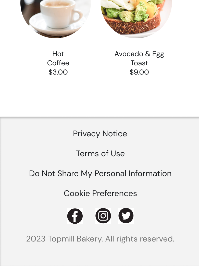
I created a mobile design for the website to be accessible from an IOS platform.
Prototype
Testing
Usability Testing
I conducted usability testing on 5 users to receive feedback on any pain points that users were experiencing.
Revisions
New Tip Entry
I changed the tip input because users were confused why the number was underlined
Changed Hamburger Dropdown Menu
I changed the profile to be included in the drop down because the interaction was not intuitive for users
Added Address and Phone Number to Mobile Home Screen
I added the bakery’s contact information to the home screen for mobile users who want the information to be easily accessible.
Conclusion
Reflection
For this project, I focused on a responsive web design. I learned to be create an accessible design on multiple platforms. This better helped me empathize with the user. I also really focused on the UI that would be most intuitive for the user. I wanted to utilize the research I found to make an easy user pathway that made sense for all users.
Takeaways
I used this platform to be able to be able to adapt my design to a mobile version from the website.
I focused on how the UI would interact with the user. I wanted to think about things like text size and color accessibility


